Magento is one of the most popular eCommerce platforms because it gives users unparalleled customization possibilities. It’s a great way to perfect user experience (UX) and user interface (UI), the two elements that make the biggest impression on modern consumers.
In such circumstances, it’s not a surprise to see over 250 thousand Magento eShops currently active on the Internet.
Magento is known for its ability to adapt to different branding styles and eCommerce niches, but some online retailers are still struggling to find the right design for their eShops. If you are facing the same problem, here are 15 Magento UX and UI steps you should follow.
Table of Contents
15 Steps to Improve Magento UX and UI
1. Create a simple homepage
A homepage is the cornerstone of your eCommerce website and the greatest traffic generator, so it’s vital to give it a simple and eye-pleasing look. Do not overload the homepage with abundant elements, but rather make it as intuitive and minimalistic as possible. Use Magento to display a few best-sellers, highlight your brand, and let your visitors go their own way from that point on.
2. Navigation needs to be effortless
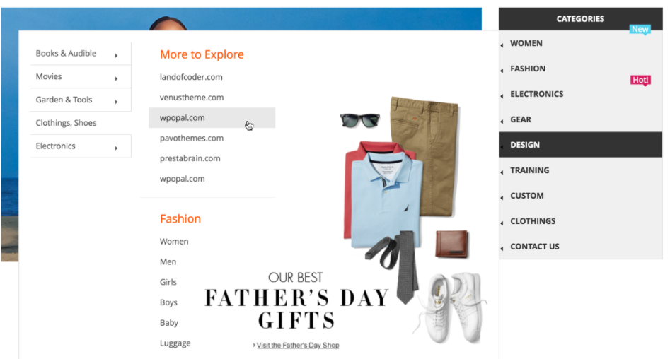
Online stores should be easy to navigate because it’s the core of UX, so you ought to respect this principle and build an intuitive menu. The point is to enable everyone to wander through the store effortlessly and without the fear of getting lost somewhere along the way.

Magento 2 Mega Menu will be a great solution to build dynamic navigation menus for your website.
3. Divide products into categories
Categories and product pages are vital to the success of your business, which is why you need to arrange them in a natural and meaningful way. Jake Gardner, a UI expert at the essay writer service, explains how to do it: “Create no more than five to seven categories with closely related SKUs. This is enough to simplify the search, but it doesn’t ruin UX with too many options.”
4. Enable filtering
You must’ve realized by now that eCommerce is all about creating a better and more comfortable experience for your customers. Magento is well aware of it and so you can take advantage of product filtering to improve the overall experience of website visitors. Filters can include features such as brands, colors, sizes, and many more. Magento 2 Layered Navigation allows your customers to browse your product catalog with ajax vertical & horizontal filter.
5. Add a search box
Another thing that can make Magento-powered stores better is the good old search box. It’s a practical tool for customers who know exactly what they want and how to search it using keywords. Add a search box to the site and you will enhance Magento UX and UI with one punch.
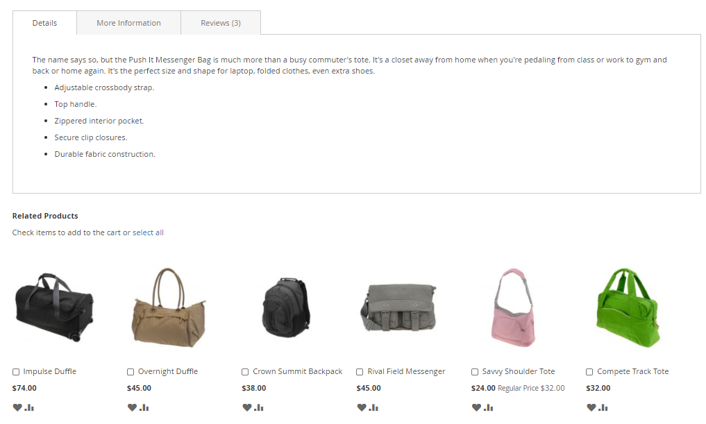
6. Show product recommendations
Product recommendations are yet another Magento feature you have to be aware of when designing an eCommerce store. Magento 2 product recommendations can give a serious boost to your upselling and cross-selling plans and it makes them ideal for every eShop.

If you don’t believe in the power of recommendations, just take a look at Amazon and you’ll realize that even the most dominant eCommerce in the world cannot help but add them to the website.
7. Write unique product descriptions
Way too many Magento clients use suppliers’ product descriptions and simply copy-paste the text, which makes a lot of eCommerce stores look the same. In order to stand out and earn a higher search engine ranking, we recommend you to write unique product descriptions using the best keywords possible.
8. Publish high-quality product images
Magento also pays attention to product images, so you ought to utilize this feature and present all of the SKUs separately. If possible, it would also be great to shoot high-quality product videos because it adds to the credibility of your business and helps shoppers to pick their favorites much easier.
9. Take advantage of testimonials
Do you know that 74% of consumers identify word of mouth as a key influencer in their purchasing decisions? That is how customer testimonials are important to the success of online retail companies, so the only reasonable decision is to include testimonials to your Magento-powered eShop. Magento 2 Testimonials will support you to monitor customer reviews and display testimonials with various styles.

10. Add gamification elements if possible
Magento offers you another interesting tactic and that is to add simple gamification elements to the website. We are talking about point systems and similar tricks that can entertain visitors and inspire them to purchase more products along the way.
11. Allow guest checkout
There is a concept in the online world called “the new account fatigue” and it describes people who are sick of creating yet another username and password just to purchase a product. Therefore, you should allow guest checkouts on your website in order to improve Magento UX and UI.
12. Focus on important details
Speaking of checkouts, remember to keep things simple and focus on important details only. Two elements are particularly important here:
- Payment details
- Shipping information
This is pretty much everything a user needs to know, so do not waste their time on irrelevant details.
13. Offer multiple payment options
Different consumers pay through different accounts and credit cards, but you don’t want to prevent anyone from purchasing in your eShop. This is why it’s fundamental to offer multiple payment options such as Stripe, PayPal, and other services popular among your target audiences. To offer Stripe for customers of your Magento website, you may need this Magento 2 Stripe Payment Pro.
14. Eliminate hidden fees and extra costs
Online buyers will refuse to pay for additional services unless you warn them on time. Our suggestion is to eliminate hidden fees and other extra costs because it will deteriorate UX and fend off potential customers.
15. Display a purchase summary
The final tip is to use Magento to create a simple but informative purchase summary. It’s a precious feature that shows product names, number of SKUs, shipping details, payment information, and perhaps even product thumbnails. Such a summary represents a nice overview and helps customers to complete the purchase without worrying about possible mistakes or inaccuracies.
The Bottom Line
Online retailers love Magento because it gives them incredible customization abilities. But not everyone is used to Magento 2 and the sheer variety of its features, so we compiled a list of the top 15 steps you could take to improve Magento UX and UI. Which ones seem to be suitable for your online business?
AUTHOR BIO
Charlie Svensson is a web designer and a blogger from London, UK. He is interested in topics like eCommerce, digital marketing, social media campaigns, and online advertising. Apart from being a writer, Charlie is a passionate traveler who enjoys meeting new cultures.
Useful Tips For You
- Best Ways to Increase Average Order Value in Magento 2
- 5 Ways To Avoid Sending Spam With Magento
- 5 Easy Tips To Optimize Performance of Your Magento Ecommerce Store
- How to Create Direct Several Online Stores Using Magento CMS
- How to build a website in 5 simple steps?
- How to Migrate Magento 2 Successfully and Without Mistakes
- How To Use Popups? Less Annoying & More Effective Guide!
- Magento 2: How to Install New Language Packs
- How to Create a Successful eCommerce Store from Scratch


![[SALE OFF] Discount 30% All Premium Extensions On Christmas And New Year 2025 christmas-and-new-year-2025](https://landofcoder.b-cdn.net/wp-content/uploads/2024/12/christmas-and-new-year-2025-1-218x150.png)


