How to minimize cart abandonment rates is always a crucial matter that every online store owner have to think about.
Table of Contents
I. Introduction
E-commerce checkout design has a massive impact on completion rates and revenue. The journey from “How to start an ecommerce business” to crafting an exceptional checkout experience is where the magic truly happens. Subpar checkout experiences routinely lead to cart abandonment issues.
Optimizing the checkout process to be seamless and customer-centric is thus essential for business success. Investing in thoughtful checkout design pays dividends through higher conversion and completion rates.
Cart abandonment, when customers leave items in the online cart, creates significant lost revenue opportunities for e-commerce businesses. Over 60% of potential orders are abandoned during checkout due to poor design factors like complicated flows or lack of trust elements.
These missed conversions directly hurt the bottom line. Cart abandonment is a top priority issue that businesses must address through optimized checkout experiences to maximize the capture of high-value sales.
This blog aims to provide actionable, proven design strategies for optimizing e-commerce checkout flows to minimize cart abandonment rates. Tactics to streamline forms, enable guest checkout, integrate progressive assurance, and allow easy edits will be covered.
Implementing customer-centric best practices at checkout will boost completion rates and revenue. The goal is to equip e-commerce businesses with practical tips for seamless, conversion-focused checkout experiences.
II. Why Cart Abandonment Occurs?
There are several common reasons customers abandon their online carts during checkout, missing out on completing the purchase. Unexpected costs often deter shoppers, such as high shipping fees or taxes only revealed at checkout. Complicated multi-step processes with lengthy forms also cause customers to bail from checkout. Required account sign ups or logins present another friction point. Lack of trust due to limited payment options or unclear security practices leads to drop-offs.
Missing assurance seals or guarantees can also increase hesitancy when submitting orders and payment details. Unoptimized checkouts erect barriers when the customer is ready to complete a transaction. By streamlining flows, building trust, and eliminating surprise costs, retailers can curb abandonment and maximize conversion at this critical stage.
Link Between Checkout Design and Abandonment Rates
There is a direct correlation between checkout design and cart abandonment rates. Poorly designed checkouts that could be clearer, more engaging, and more trust elements see significantly higher abandonment. Various studies illustrate this relationship. Research by Baymard Institute shows over 88% of online shoppers have abandoned a shopping cart due to a poor checkout experience.
Ioannis Gorris from ConversionXL found that an arduous checkout process caused nearly 70% of cart abandonments. On the other hand, sites with optimized checkouts incorporating best practices like minimal forms, guest checkout, and clear instructions can decrease abandonment by 35% or more.
Seamless, customer-centric checkouts provide an efficient path to purchase completion. The bottom line is that improper checkout design results in lost customers, while well-designed flows retain shoppers and increase conversion to drive revenue.
III. Strategies to Minimize Cart Abandonment Rates
Without further word, let’s explore 11 most efficient strategies for reducing cart abandonment rate as follows.
3.1. Simplifying the Checkout Process
Simplified checkout experiences dramatically reduce cart abandonment. Streamlining forms, minimizing steps, offering guest checkout, and providing an easy path to purchase are powerful strategies. Simplicity removes customer effort and friction.
One-page checkouts minimize steps versus multi-page. But longer multi-page flows allow splitting complex forms. The approach depends on your business needs. Maintain simplicity either way.
A progress indicator tracking checkout steps provides clarity for customers. It sets expectations for the process length to prevent surprise drop-offs. The visual keeps shoppers engaged through the completion of all steps.
3.2. Mobile-Friendly Checkout Design
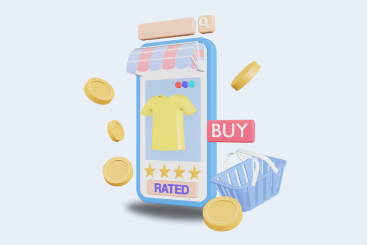
- Rise of Mobile E-commerce: Mobile purchases account for over half of all e-commerce. Customers expect sites to cater to mobile users. Unoptimized mobile checkouts result in incredibly high abandonment rates.
- Importance of Responsive Design: Responsive web design creates checkouts tailored to any device size. Flexible layouts, large click areas, and minimal scrolling enhance mobile usability. Non-responsive checkouts frustrate users.
- Enhancing Mobile Usability with Touch-Friendly Elements: Touch elements like swipes, zooms, and taps improve mobile checkout interactions. Error-proof data entry also helps on smaller screens. Keep mobile users engaged through the final steps.
3.3. The Guest Checkout Option
- Advantages of Guest Checkout: Enabling guest checkout removes friction by skipping account creation. Customers can seamlessly purchase faster with minimal data entry. This caters to first-time shoppers and reduces abandonment.
- Balancing Guest Checkout and Account Creation: Offer guest checkout and gently encourage account sign-up through post-purchase emails—this balances conversion with building customer profiles. Make signing up optional and incentivized.
- Reducing Friction for First-Time Customers: Optimize guest checkout for new customers who prefer quick, hassle-free purchases. Guaranteed security and savings opportunities entice sign-ups after positive first purchases.
3.4. Transparent Pricing and Fees
- Displaying Costs Upfront: Surprise fees are a huge driver of abandonment. Showcase all costs upfront, like shipping and taxes. Transparent pricing sets proper expectations.
- Explaining Shipping Costs, Taxes, and Extra: Detail how shipping rates are calculated and any supplemental fees. Provide real-time previews of total costs as customers input information. Full transparency removes sticker shock.
- Building Customer Trust Through Transparency: Being upfront about final costs builds customer trust in the checkout process. Shoppers feel fully informed about their pay, with no hidden surprises. Transparency demonstrates honesty.
3.5. Building Trust and Security
Incorporating Trust Signals by incorporating trust symbols like Norton Secured or McAfee Secure badges signals legitimacy. Displaying these unbiased third-party security seals assures customers their data is safe. Other recognizable indicators like the TRUSTe or BBB seals also build credibility.
Prominently highlight the SSL certificate and HTTPS site encryption to signal sensitive data is transmitted securely. Visual security cues like the padlock icon establish protection. Detail encryption levels and compliance with standards like PCI DSS for reassurance.
Displaying genuine customer reviews, testimonials, and ratings provides social proof from past purchasers who successfully and happily completed the checkout process on your site. This organic peer reassurance helps overcome hesitations and builds credibility through shared experiences.
3.6. Crafting Effective Call-to-Action (CTA)
The final checkout button is the most important CTA driving purchase completion. Its design and messaging must motivate customers to transact. Make the button visually stand out through contrasting colors, shapes, sizes, or motion. Use an action-driving test like “Complete Purchase” instead of “Checkout.”
Persuasive language propels customers to act. CTAs should use active, urgent verbs and commands focused on the desired outcome, like “Confirm Your Order Now”. Avoid passive or generic terms like “Submit” or “Continue”. Action-oriented language converts.
Removing surrounding distractions like ads or unnecessary buttons ensures the primary checkout CTA gets user focus. Isolate the checkout button on an uncluttered space so it is clearly emphasized. Distraction-free prominence drives action.
3.7. Offering Multiple Payment Options
In the online shopping world, people have different payment methods they prefer. Some like credit cards, while others use digital wallets like PayPal. By offering choices, online stores can make all customers happy. This boosts confidence and reduces abandoned carts. To do this well, understand your customers’ preferences and make suitable options.
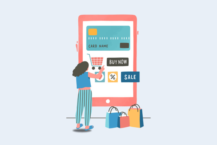
Online stores should have different payment ways. Apart from cards, add digital wallets, bank transfers, or payment plans. Digital wallets are quick and secure, while bank transfers suit cautious buyers. Payment plans help those who can’t pay at once. Seamless checkout design and clear communication about these methods make shoppers trust you more.
When you provide many payment choices, explain them clearly. Tell how digital wallets or bank transfers work and why they’re safe. Clear instructions help shoppers feel secure and understand their options. This builds trust and encourages completing purchases instead of leaving them unfinished.
3.8. Visual Product Summary
Displaying a Clear Cart Summary: Give shoppers a simple and easy way to see what’s in their cart. A clear summary with item names, quantities, and prices helps them know exactly what they’re buying. This transparency avoids confusion and encourages proceeding to checkout with confidence.
- Using Thumbnail Images and Descriptive Labels: Pictures speak louder than words. Show small images of the items in the cart, along with clear labels. This visual representation helps shoppers quickly identify their selections, especially in a hurry. Descriptive labels further clarify what each product is, ensuring accuracy and preventing any doubts.
- Simplifying Editing and Removal of Items: Mistakes happen. Make it effortless for shoppers to adjust their cart. Include easy-to-spot buttons for adding, removing, or changing quantities. A smooth editing process lets customers fine-tune their orders without frustration. This convenience increases the chances of completing the purchase, as shoppers feel in control of their choices.
3.9. Exit-Intent Popups for Retention
Exit-intent tech is smart. It detects when a shopper is about to leave your site and triggers a popup. This is like a gentle tap on the shoulder, giving a chance to stay a bit longer. It shows you care about their interests. Use this tech wisely, so it’s helpful and manageable.
Leaving customers can still be saved. Offer something extra – like a discount, free shipping, or a special deal – to tempt them into staying. Incentives make them think twice and might just turn them back to complete their purchase.
Time can be a friend. Make your exit-intent popup time-sensitive. Tell shoppers they have a limited window to grab the offer. This creates a sense of urgency. If they’re interested, they likely finish their purchase faster to snag the deal. Just remember, be sincere and fair with your urgency tactics.
3.10. User-Friendly Error Handling
Errors can be confusing. When something goes wrong, tell shoppers in simple language what the problem is. Make sure your error messages suggest a solution. This helps users understand what’s happening and guides them to fix the issue.
Imagine a spotlight on a stage. Highlight fields with issues like missing info or wrong formats. This directs shoppers’ attention to exactly where the problem is. It saves time and reduces frustration, making the checkout process smoother.
Checkout hiccups can be annoying. Make sure your error handling is friendly. Nobody likes forms with red marks all over. Keep error messages polite and offer guidance. A frustrated shopper might abandon their cart. But a patient is likely to complete the purchase.
3.11. Continual Improvement through A/B Testing
Think of A/B testing as trying on different outfits to see which looks best. Test changes in your checkout design – like button colors or layouts. It helps you find what shoppers like more. Minor tweaks can lead to significant improvements and fewer abandoned carts.
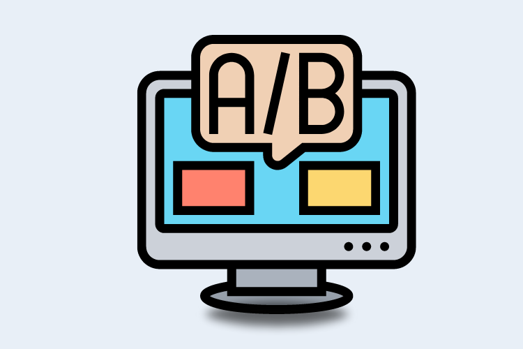
Data is your friend. Look at what users do on your site. Where do they spend time? When do they leave? This info helps you understand what’s working and what needs fixing. Analytics give insights to make smarter decisions.
It’s a journey, not a destination. After testing and analyzing, continue. Keep refining your checkout. Small steps at a time. This iterative approach fine-tunes the process over and over, leading to smoother experiences and happier customers.
IV. Conclusion
Effective checkout design is vital. From clear CTAs to secure payment options, each strategy plays a role. Remember the power of transparency, simplicity, and user trust.
When you nail checkout design, you minimize cart abandonment rates. Shoppers feel confident and complete their purchases. This benefits your business’s bottom line.
It’s time to take action. Apply the discussed strategies to your e-commerce checkout. Better designs mean happier customers and more completed orders. Start reducing abandoned carts and boosting conversions today.
Author Bio
Priyanka Prajapati, is a dedicated Content Manager at Brainspate – A Top eCommerce Development company since 2023, thrives on her love for eCommerce. With engaging writing, she enlightens readers, leaving an indelible impact in the digital landscape.




![[SALE OFF] Discount 30% All Premium Extensions On Christmas And New Year 2025 christmas-and-new-year-2025](https://landofcoder.b-cdn.net/wp-content/uploads/2024/12/christmas-and-new-year-2025-1-218x150.png)


