


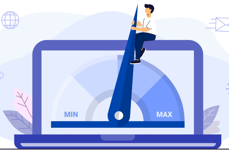
High-performing websites look appealing and help users navigate through content with intent. Many websites look polished but leave visitors unsure where to click or what comes next. Without thoughtful structure, even the best content can lead to dead ends or confusion.
Are users getting stuck on your homepage? Do visitors scroll but never convert or take action? Can better flow turn passive views into meaningful interactions?
These are common issues that design alone doesn’t always fix. It’s the journey that makes the difference, not just the visuals. This article will explore what high-performing websites get right about user flow and how you can apply it.
Table of Contents
I. Structure That Reflects User Intent
High-performing websites anticipate visitor behavior and organize content accordingly. New visitors want summaries and intuitive paths, while returning users need quick access to specific tools or accounts. Clear navigation using menus, breadcrumbs, and headers supports different goals.
First-time visitors usually look for overviews and easy-to-navigate options. A well-organized layout helps reduce frustration and improve time spent on the site. Breadcrumbs, menus, and navigation bars work together to guide the journey.
Indeed notes that a clean, structured layout helps users feel confident and stay longer to explore more content. Easy navigation increases engagement, improves search visibility, and even boosts purchase rates by guiding users efficiently. When users find what they need quickly, they’re more likely to trust and return.
These tools function best when tailored to typical user expectations and behaviors. Data insights from analytics often shape structural improvements over time. Websites that perform well continuously adapt to user behavior patterns for long-term success.
How does website structure affect mobile behavior differently?
Mobile users often skim and expect direct access to essentials within minimal screen space. A structured mobile layout prioritizes top user actions and scroll paths, improving conversion. Touch-based interactions must feel intuitive, with fast feedback reinforcing confident navigation in tighter environments.
II. Website Design That Lets the Content Lead the Way
Good design supports great flow. High-performing websites use clean, minimal design to guide users intuitively. Layouts with strong contrast and alignment reduce confusion. Industries like legal services require clarity due to sensitive content—high-performing websites in this sector must balance professionalism with empathy.
Law firms are a clear example where visual clarity builds user confidence. One reason design matters so much in law firm websites is information delivery. Visitors often come looking for legal answers involving specific, time-sensitive cases. Law firms responding to current mass torts must present facts with sensitivity and care. One such case is the Snapchat lawsuit, which has stood out for its emotional weight and national reach.

According to TorHoerman Law, it deals with youth mental health, a topic that demands emotional awareness and precision. Allegations include anxiety, depression, addiction, self-harm, and in some cases, suicide. Plaintiffs argue that algorithm-driven features encouraged obsessive behavior and worsened mental health.
Design in such sensitive lawsuits must communicate urgency without panic, and legal options without overwhelming detail. A poorly designed page could increase distress or cause users to disengage. These principles apply well beyond legal services and hold true across industries with high user expectations. When content leads and design supports, websites become easier to navigate, more trustworthy, and more effective.
Does the design style of a website affect the user’s emotional readiness to act?
Design tone helps users feel either urgency or comfort depending on their browsing purpose. For instance, soft tones encourage exploration, while bold contrasts suggest time-sensitive decisions or offers. Aligning emotional cues with expected outcomes improves the chance of a meaningful conversion.
III. Logical CTAs That Appear at the Right Time
A call-to-action should appear when the user feels ready to proceed. Effective websites place CTAs after the visitor receives enough helpful information. Jumping to offers too early often causes users to exit the page.
CTAs following testimonials or pricing comparisons feel timely and well-earned. The action feels more natural when placed in the right context. Every good CTA needs clear wording and visible placement without feeling intrusive.

Search Engine Land states that in-line CTAs often perform well, but it’s smart to test different placement options too. Try using banners, sidebar buttons, or top navigation dropdowns to see what clicks. Watch both your conversion rate and bounce rate while running these tests. If conversions stay flat and the bounce rate rises, try another approach.
Users prefer buttons that explain what happens after they click on them. A good CTA removes doubt and helps move the journey forward. Placing CTAs thoughtfully increases conversions and improves the user experience.
Why is CTA wording length important?
Too short, and the message may feel vague; too long, and it may overwhelm users. Phrasing that blends clarity with brevity performs best in guiding action without causing doubt. Effective CTA copy feels natural, directly reflects the benefit, and inspires confident movement forward.
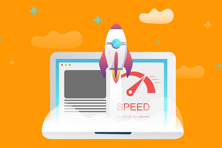
IV. Speed That Keeps Momentum Going
Fast websites help keep users engaged and willing to explore more content. Every second of delay increases the chance a visitor will leave early. High-performing sites prioritize speed through compressed images and optimized coding practices. This principle applies not only to eCommerce or service websites but also to platforms offering interactive content like free online games, where a fast, seamless experience is key to keeping users engaged.
Business.com mentions that every extra second your website takes to load can hurt your conversion rate significantly. Portent reports that sites loading in one second convert three times better than those loading in five seconds. Compared to a 10-second load time, one-second sites are five times more effective. These numbers clearly show that faster websites lead to more sales and inquiries.
A clean design also helps load pages faster by avoiding heavy visual elements. Speed matters even more on mobile, where slow sites often lose users. Responsive designs ensure the flow works smoothly across all devices and browsers.
Speed is about maintaining interest, especially during checkout or sign-up moments. A fast-loading page encourages users to take more steps without hesitation. Website momentum depends heavily on consistent, quick performance throughout.
Does website speed affect SEO beyond bounce rate?
Search engines evaluate speed as part of core ranking signals for mobile and desktop experiences. Faster websites often enjoy higher visibility and better click-through rates in search results. Improved speed helps SEO indirectly by increasing user retention and engagement metrics.
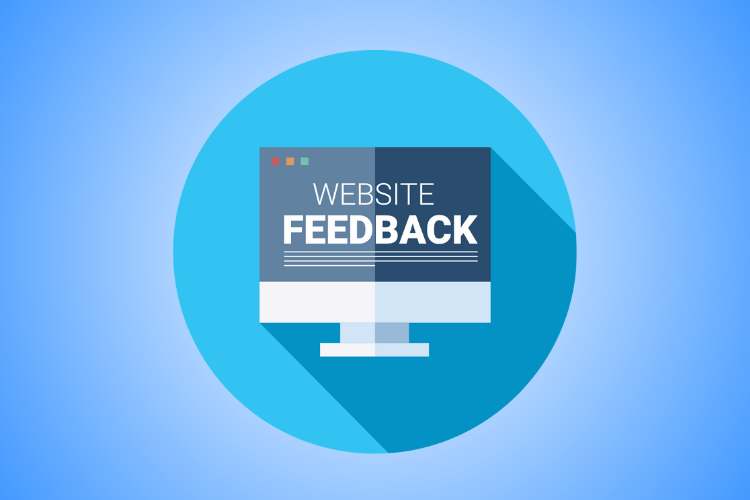
V. Feedback That Guides Without Interrupting
Users need subtle feedback that confirms their actions are being processed correctly. Websites that perform well use visual cues to support smooth navigation. Hover effects, loading spinners, and form validation messages provide this feedback clearly.
Forbes highlights that the small animations and icons that give feedback and keep users engaged are called micro-interactions. These subtle touches make interfaces feel faster, smoother, and more enjoyable to use. When done well, micro-interactions boost usability and bring personality to every user interaction.
These features guide users without breaking their flow or adding confusion. After a form is submitted, a thank-you message provides closure and clarity. Progress bars during multi-step processes help users know what’s coming next.
Feedback builds confidence and helps reduce the anxiety of digital interactions. When users feel guided, they are more likely to complete their intended tasks. These design details improve user satisfaction and lower drop-off rates.
Can feedback influence how trustworthy a site feels?
Instant and visible system responses reduce user doubt and enhance perceived reliability. When users notice that their actions register consistently, they believe the site is well-maintained. Trust grows when systems behave predictably and confirm that user effort was successful.
High-performing websites do more than look good; they guide users with purpose and clarity. Great design blends layout, speed, CTAs, and feedback to support a smooth browsing experience. Visitors should feel confident with every click, finding what they need without frustration or confusion.
Logical progression and clear communication are key to helping users stay engaged and take action. Subtle touches like animations and fast-loading pages keep things moving effortlessly. Smart websites lead users on a journey that feels natural and rewarding. When every element supports the flow, users are more likely to convert and return.
Final Thought
High-performing websites succeed not just because they look good, but because they guide users with precision, empathy, and intent. From structured layouts to emotionally aligned design, timely CTAs, fast performance, and subtle feedback loops—every element works together to create a seamless user journey. By applying these principles, businesses can transform casual visits into meaningful engagement and conversions. In a digital landscape where attention is fleeting, mastering user flow is not optional—it’s essential for long-term success.


