


 on Organic Traffic Strategies in 2026")


Every ecommerce marketer knows the sting of lost sales. You’ve driven traffic, optimized product pages, and maybe even spent a small fortune on ads, only to see visitors abandon their carts or bounce before checkout. While this can be frustrating, those obstacles, often referred to as sales friction, can be reduced or entirely eliminated with the right tactics.
The average ecommerce conversion rate in 2025 hovers between 2% to 4%, depending on the industry. That’s a slim margin, but it also means there’s room to grow. Here, we’ll help you hit that mark and even go beyond. In this post, we’ll dig into practical strategies to smooth out the customer journey, tackle common barriers to purchase, and boost conversions without relying on gimmicks or guesswork.
Table of Contents
Tactic #1: Create blog content for shoppers at the bottom of the sales funnel
Bottom-funnel blog content packs serious conversion power because it targets shoppers who’ve already done their homework. These readers aren’t casually browsing. They’re ready to buy and just need that final push to make their decision.
By creating content that compares products, highlights specific features, and addresses common buying concerns, you’ll help them cross that finish line with confidence.
To nail this strategy, focus on creating detailed comparison posts, buying guides, and product roundups. Make sure to:
- Break down key product features into clear, scannable sections.
- Include specific use cases and scenarios.
- Address common customer hesitations head-on.
- Compare pricing and value propositions transparently.
- Add high-quality product images and specs.
- Include clear, prominent CTAs that lead directly to purchase pages.
Remember to keep the content objective and thorough. Your readers are scrutinizing details at this stage, so vague descriptions or overly promotional language will send them running to competitors.
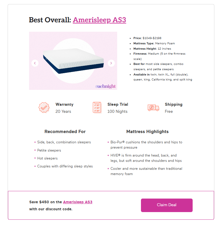
A great example of this approach comes from Eachnight, a leading sleep wellness platform that helps people make informed decisions about their sleep products. Their comprehensive guide to the best mattresses of 2025 shows bottom-funnel content done right.
They’ve structured the guide to include detailed breakdowns of each mattress, complete with specs, highlights, and ideal user profiles.
What makes their approach particularly effective is the strategic placement of bold CTAs under each product review, creating a frictionless path to purchase. Readers can easily compare options and, once they’ve made their choice, click through to buy immediately – no hunting around required.
This direct approach to conversion optimization can help you significantly boost your sales through some simple content marketing efforts.
Tactic #2: Incorporate plenty of visual trust signals
Trust is the cornerstone of ecommerce success. Without it, even the most optimized website can struggle to convert visitors into buyers.
For instance, 87% of online customers say they won’t do business with a company if they have doubts about its security practices. That’s why incorporating visual trust signals (elements that reinforce credibility and professionalism) is essential for overcoming sales friction.
To effectively incorporate trust signals on your site, focus on these key elements:
- Display security badges and SSL certificates prominently near checkout areas.
- Showcase authentic customer reviews and ratings.
- Include detailed shipping and return policies.
- Feature media mentions and industry certifications.
- Add trust-building microcopy near conversion points.
- Highlight money-back guarantees or trial periods.
- Include real customer photos and video testimonials.
The key is to strategically place these elements where customers typically experience hesitation, like product pages and checkout flows. But don’t overwhelm visitors. Select the most relevant trust signals for your specific audience and integrate them naturally into your design.
Bay Alarm Medical, a company specializing in life-saving medical alert systems, exemplifies this approach perfectly. They understand that when people shop for medical safety devices, trust is a vital requirement.
Their homepage features a confidence-building “15-Day Risk-Free Trial” CTA right at the top, immediately addressing potential purchase anxiety. They’ve cleverly positioned a floating element in the bottom left corner that displays their impressive Google rating and review count, providing social proof at a glance.
Perhaps most compelling is their video testimonials section, where current customers and healthcare professionals share real experiences with their products.

Leverage trust-focused visuals like these, and you can create an environment where customers feel confident about making purchases, boosting both conversions and loyalty.
Tactic 3: Answer common product questions early
When shoppers have questions about your products, they’ll keep digging until they find answers. If they can’t find them quickly, they’ll bounce, often straight to a competitor who provides clearer information.
This is particularly important for products where making the wrong choice could have serious consequences, like health equipment or safety gear.
By proactively answering questions upfront, you reduce uncertainty and create a smoother path to purchase.
To implement this strategy effectively, focus on:
- Creating detailed FAQ sections that appear before product listings.
- Developing comprehensive buying guides that explain product categories.
- Using comparison charts to highlight key differences between models.
- Including installation or usage information upfront.
- Adding expert advice sections to build confidence.
- Creating clear category pages that explain product types.
- Highlighting important specifications before the product details.
Also, make sure to anticipate and answer questions in a logical order, starting with the basics and moving to more specific details. This way, shoppers arrive at your product pages already informed and confident about their needs.
National Safety Mirror, a specialized provider of traffic safety mirrors, demonstrates this approach brilliantly. Before presenting their driveway and traffic mirrors catalog, they offer in-depth explanations about their safety mirrors’ features and applications.
They guide visitors through crucial info like installation requirements, visibility ranges, and durability factors, all before showing a single product.
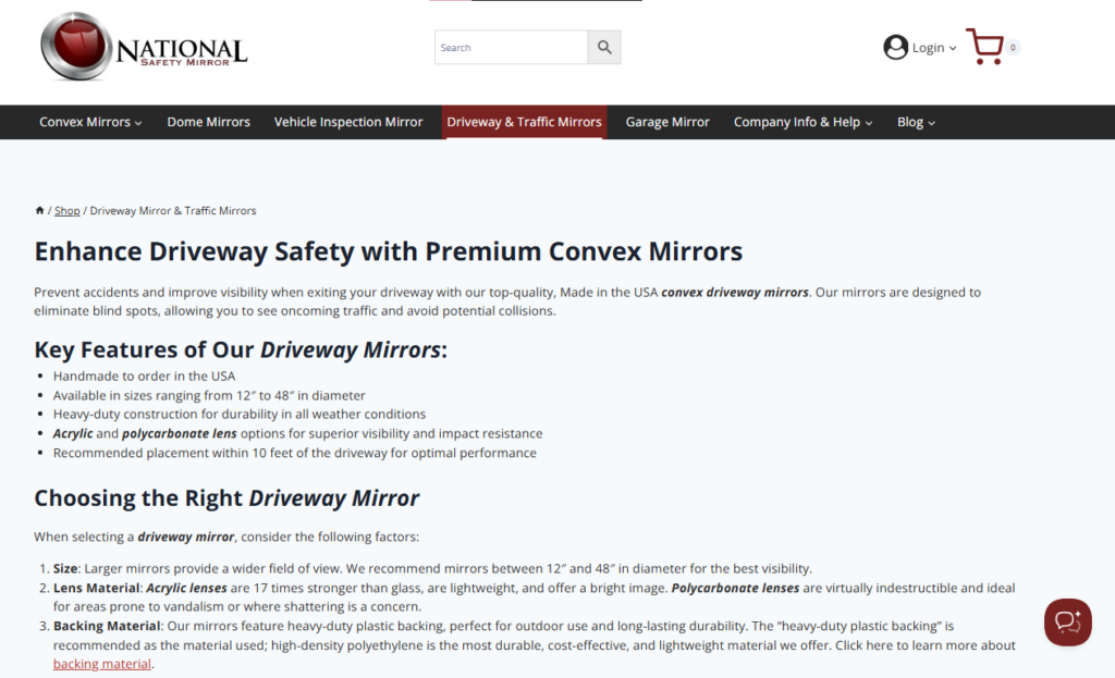
This educational approach helps customers understand exactly what they need before they start comparing specific models.
By front-loading this vital information, you can streamline the decision-making process and reduce the likelihood of returns or customer dissatisfaction. It’s a smart strategy that shows that you understand your customers’ need for thorough information.
Tactic 4: Delve into the details of product USPs
Understanding what sets your product apart is essential for customers, especially when they’re comparing options. Shoppers need to know why your product is the best fit for their needs, and highlighting your product’s unique selling points (USPs) in detail helps them make informed decisions.
This is an effective strategy because it gives potential buyers a deeper appreciation for your product, focusing their attention on what makes it superior. When customers see value clearly communicated, it builds trust and reduces decision fatigue.
To effectively showcase your product USPs:
- Break down complex features into clear, benefit-focused explanations.
- Use comparison tables to highlight advantages over competitors.
- Create dedicated content pieces for each major product feature.
- Include real-world applications and scenarios.
- Support claims with specific data or test results.
- Add visual elements like diagrams or videos to illustrate benefits.
- Connect features directly to customer pain points and solutions.
- Share user testimonials that specifically mention key features.
The goal isn’t to overwhelm with technical specs but to help customers understand why specific features solve their problems better than alternatives.
EXT Cabinets, a specialist in outdoor kitchen solutions and cabinetry, excels at this approach. Instead of simply listing product features, they create detailed content that educates customers about specific components and their importance.
Their blog post about flame tamers in gas grills is a perfect example. Rather than just mentioning flame tamers as a feature, they’ve created comprehensive content that explains what they are, why they matter, how different types work, and how to choose the right one.
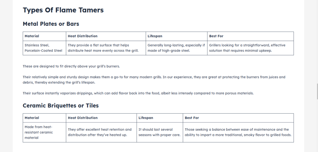
This level of detail helps customers understand what they’re buying and why each feature adds value to your products.
Tactic #5: Develop a smart search functionality
Smart search shouldn’t be just a nice-to-have feature because it’s often the difference between a sale and a bounce.
When customers can’t find what they’re looking for quickly, they’ll leave your site frustrated. Even worse, they might assume you don’t carry the product they want, even if it’s sitting right there in your inventory.
A powerful search function acts like a virtual sales assistant, guiding shoppers directly to their desired products.
To assist your customers in their search for the perfect product:
- Enable real-time search suggestions as they type.
- Include product thumbnails in search results.
- Show relevant product categories alongside results.
- Account for common misspellings and synonyms.
- Display pricing and availability in search results.
- Include filters for quick refinement.
- Prioritize popular and high-converting items.
- Make the search bar prominent and easily accessible.
- Add autocomplete functionality for faster searching.
Remember to regularly analyze search data to understand what customers are looking for and optimize your system accordingly.
Mejuri, a contemporary fine jewelry brand, shows how powerful smart search can be in action. With their extensive catalog of nearly 1,000 jewelry designs, they’ve transformed what could be an overwhelming browsing experience into a smooth, intuitive journey.
Their search function springs to life as soon as customers start typing, displaying real-time results complete with product images. The system doesn’t just show matching items but intelligently suggests related jewelry categories, helping shoppers discover options they might have missed.
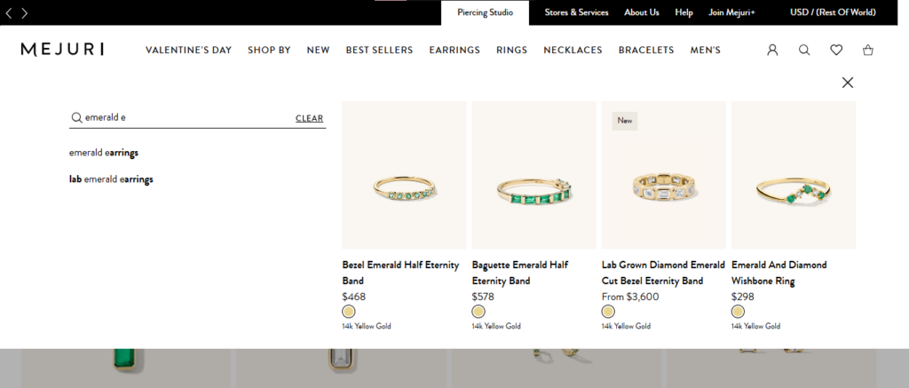
This thoughtful approach to search functionality means customers can find what they’re looking for in seconds, whether it’s a specific ring style or a particular type of necklace.
This is a perfect example of how smart search can remove friction from the shopping experience and guide customers smoothly toward purchase.
Tactic #6: Streamline the checkout process for conversion optimization
A complicated checkout process is one of the biggest barriers to completing a sale. In fact, 22% of online shoppers abandon their carts because the checkout process is too long or confusing. Simplifying this final step can significantly reduce friction and improve your conversion rates.
This works because customers value efficiency and convenience. When the path to purchase feels tedious or overwhelming, they’re far more likely to leave before completing their order. A streamlined checkout ensures a faster, hassle-free experience, which keeps customers focused and engaged until the very end.
Think about it: after all the work you’ve done to get customers to add items to their cart, losing them at the final hurdle is particularly painful.
To create a friction-free checkout experience, focus on these key elements:
- Offer guest checkout options to eliminate registration barriers.
- Include multiple payment methods, including digital wallets.
- Minimize form fields to essential information only.
- Use auto-fill capabilities where possible.
- Show a clear progress indicator.
- Keep shipping options and costs transparent.
- Place security badges prominently.
- Enable address verification to prevent errors.
- Maintain mobile-friendly functionality throughout.
Keep in mind that you need to make the path from cart to purchase as smooth and quick as possible while maintaining customer confidence.
Peloton, the popular indoor exercise bike manufacturer, demonstrates checkout optimization done right. Despite selling high-ticket fitness equipment, they’ve created a checkout process that’s as sophisticated as their bikes but remarkably simple to use.
Their single-page checkout eliminates the typical multi-step hassle, while integration with Google Pay and Apple Pay means customers can complete their purchase with just a few taps. By offering a guest checkout option alongside their member accounts, they’ve struck the perfect balance between convenience and building strong customer relationships.
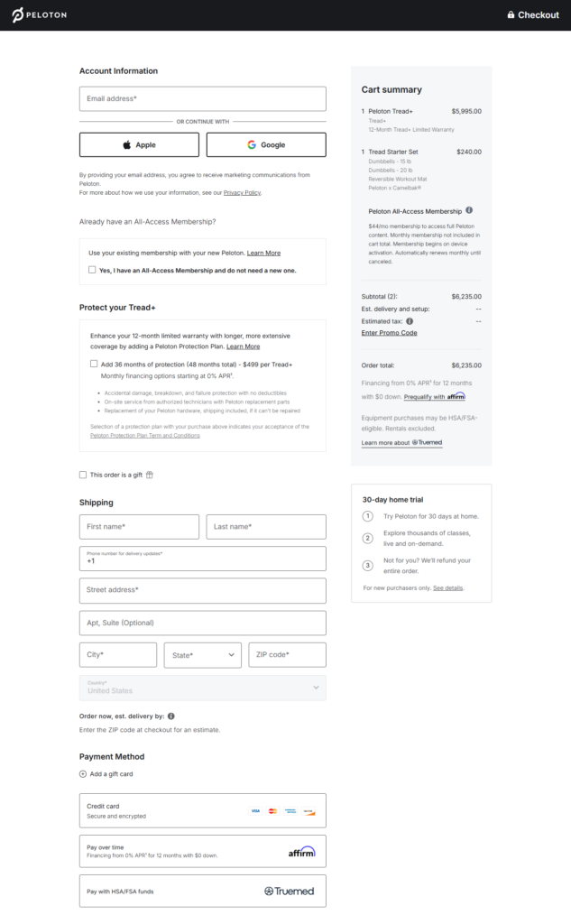
This is a masterclass in removing purchase barriers, even when the purchase is a significant investment. Customers can focus on their excitement about their new fitness journey rather than getting bogged down in checkout complications.
Final thoughts
Every barrier between your customer and the checkout button is a missed opportunity waiting to be resolved. Improving conversion rates shouldn’t be about rigid formulas but about understanding your customers’ hesitations and addressing them step by step. Pick one of these tactics to start the conversion optimization journey today.
Test it, tweak it, and let those small, intentional changes add up to meaningful results!


