If you’re reading this, you already know that your product page isn’t just a page. It’s the deal-maker or breaker. It’s 2025: competition is at an all-time high, and shoppers won’t give mediocre sites a second chance.
That’s why your product page needs to do more than just “look good.” It has to convert.
However, too many marketers still miss the mark. They pour all of their energy into flashy designs or overloading the page with features, while what really matters is creating a seamless experience that makes customers want to buy.
Here, we’re breaking down the essentials of a winning product page. From elements that guide the eye to copy that builds trust and even the latest trends you can’t ignore, we’ve got you covered.
Table of Contents
1. Use subscription purchase triggers that boost CLV
Subscriptions are no longer just a convenience. They’re a powerhouse strategy for increasing customer lifetime value (CLV).
When done right, subscriptions create steady revenue streams and encourage repeat purchases.
The key is to make signing up irresistible by tapping into what consumers value most: perks like free shipping and the freedom to cancel anytime. These features reduce friction and make customers feel they’re in control, which is essential for long-term loyalty.
To do it right, keep these best practices in mind:
- Highlight the benefits clearly.
On your product page, make the subscription option visually distinct and ensure it’s immediately clear what customers gain, whether it’s discounts, free shipping, or exclusive perks.
- Keep it flexible.
The ability to pause or cancel at any time removes hesitation. Customers are more likely to subscribe when they know they’re not locked into something rigid.
- Add immediate value.
Sweeten the deal with a discount for subscribers. Even a small percentage off can make a big difference in conversions.
We can witness how this works in real life by exploring Armra, a brand specializing in grass-fed colostrum supplements. On their Immune Revival Unflavored Jar product page, they’ve made the subscription option stand out. It’s visually prominent, showcasing a 5% discount that makes it more attractive than the one-time purchase. Combined with the flexibility to cancel anytime, this setup reduces barriers to entry while incentivizing repeat purchases.
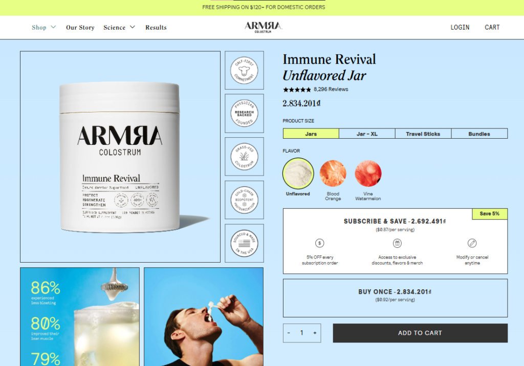
Armra’s approach is proof that a thoughtfully designed subscription option doesn’t only drive conversions but also fosters loyalty and boosts CLV, making it a win-win for both the customer and the brand.
2. Display explainer videos that answer common shopper questions
When it comes to answering customer questions, few strategies are as effective as using videos. In fact, the most recent statistics from Wyzowl show that 87% of surveyed consumers have been convinced to buy a product or service after watching a video.
That’s because videos simplify information, build trust, and help customers visualize what they’re getting – something static text or images just can’t do as effectively.
The secret to success lies in addressing common pain points or uncertainties that shoppers might have. These could include questions about how the product works, how it’s assembled, or even how it looks in real life.
To do it right, follow these principles:
- Focus on clarity.
Keep the video short and to the point. Use clear visuals and simple explanations to highlight your product’s key features and benefits.
- Answer specific questions.
Use insights from customer feedback or FAQs to address the most common questions directly. This will eliminate the need for customers to hunt down information.
- Optimize for mobile.
Since many shoppers browse on their phones, make sure your video loads quickly and is mobile-friendly.
A brand nailing this tactic is WholeWoodPlayhouses, a niche business selling ready-to-assemble outdoor kids’ playhouses. On their Playhouse Arctic Nario product page, they include a detailed explainer video showing exactly how to assemble the playhouse. Prospective buyers can see the size, parts, and assembly process clearly, leaving no room for uncertainty.
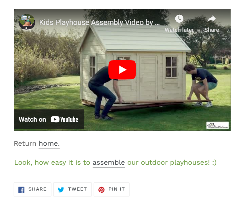
This approach answers common questions and builds confidence in the product and the brand. By showing the ease of assembly, WholeWoodPlayhouses eliminates doubts and helps convert browsers into buyers seamlessly.
3. Integrate user-generated content to boost review legitimacy
User-generated content (UGC) has become a cornerstone of trust in ecommerce. It’s because shoppers trust other shoppers more than they trust brands. To be more precise, 88% of consumers say they trust recommendations from people they know above all other forms of marketing.
UGC, in the form of reviews, photos, and testimonials, brings authenticity to your product pages. It helps bridge the gap between skepticism and confidence. But not all UGC is created equal. To do it right:
- Encourage visual content.
Reviews with photos or videos are far more impactful than text alone. They allow potential buyers to see the product in real-world settings, making the experience relatable and believable.
- Make it easy to contribute.
Simplify the process for customers to leave reviews or upload content. Provide clear instructions and incentives like discounts on future purchases to motivate participation.
- Highlight the best content.
Curate UGC to showcase diverse use cases or standout reviews prominently on your product page. This ensures visitors quickly see the value others have experienced.
Golf Cart Tire Supply does a great job with this. On the product page for their Vampire Machined Golf Cart Wheels, they allow customers to post reviews with images of their purchase. This way, buyers can see how the wheels look in real-world settings, helping them visualize the product on their own golf carts.
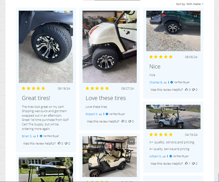
This strategy validates the quality of the product and creates an invaluable sense of community and trust. So, use UGC to your advantage and ensure that your product pages convert curious browsers into confident buyers.
4. Feature trust signals that address common shopper concerns
When shopping online, customers are often hesitant because they can’t physically see or touch the product. That’s where trust signals come in. They reassure shoppers that their purchase is safe and that the brand is reliable.
By addressing common concerns like shipping costs, return policies, or secure payments, you can reduce friction and increase conversions.
To do this effectively:
- Identify shopper concerns.
Think about what might hold customers back from completing a purchase. Are they worried about returns? Hidden fees? Quality? Address these concerns upfront.
- Make trust signals prominent.
Place key reassurances like free shipping, satisfaction guarantees, or secure payment badges near the purchase button or in easy-to-spot areas of your product page.
- Provide detailed explanations.
For more complex policies (like returns or warranties), include expandable sections or tabs where shoppers can learn exactly how those benefits work. Transparency goes a long way in building trust.
You’ll find a great example of this on the Mannequin Mall website. On their product page for a female professional dress form, they use a checklist just below the purchasing CTA (call-to-action). It highlights key benefits, including free shipping, the lowest price guarantee, a 7-day money-back return policy, and human customer support.
Beneath the checklist, they provide detailed tabs explaining each benefit, like how their satisfaction guarantee works or what the returns process looks like.
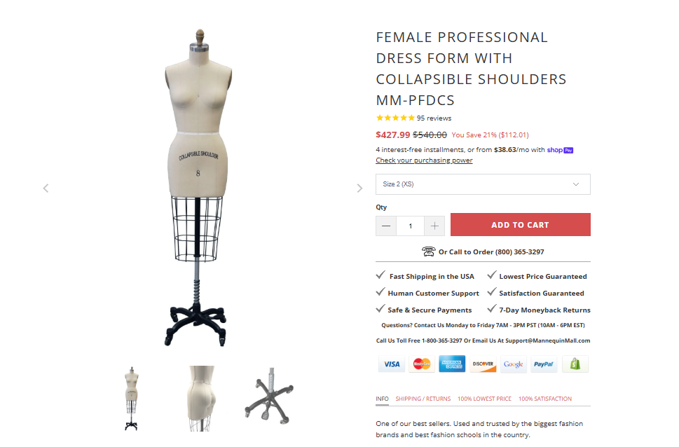
Mannequin Mall’s approach eliminates guesswork and makes shoppers feel secure, addressing their concerns head-on. This strategy builds confidence while encouraging buyers to click “Add to Cart” with peace of mind.
5. Add cross-selling options that amplify AOV
Cross-selling is one of the most effective ways to increase average order value (AOV) while enhancing the shopping experience. By recommending complementary or related products, you encourage customers to discover more of your offers, often resulting in higher purchase totals.
When done well, cross-selling feels intuitive rather than pushy, making shoppers more likely to add those extra items to their cart.
To do it right:
- Make recommendations relevant.
Use purchase data, browsing behavior, or product compatibility to suggest items that genuinely complement the shopper’s current selection.
- Keep it seamless.
Place cross-selling sections where they naturally fit, like below the purchasing CTA or at checkout. Make it easy for customers to add items with one click.
- Vary the approach.
Offer different types of suggestions, like “You May Also Like” for similar items, “Frequently Bought Together” for bundles, or personalized recommendations based on user behavior.
A standout example here is Bala, a brand that specializes in sleek, design-forward fitness equipment.
On the product page for their jump rope, they’ve perfected cross-selling with three dedicated sections. First, they display a “You May Also Like” section just below the purchasing CTA, featuring related products.
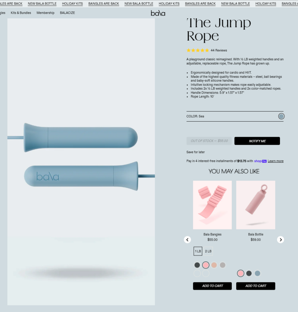
Next, they use personalized recommendations tailored to the shopper’s interests and browsing history.
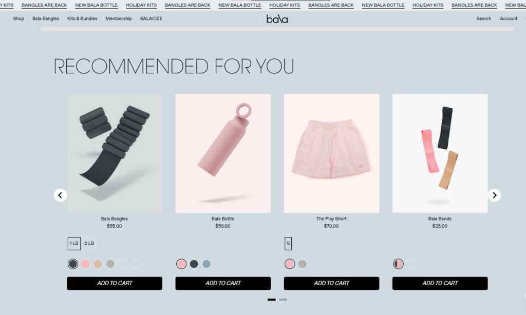
Finally, they showcase a “Frequently Bought Together” section with complementary items, all of which can be added to the cart with a single click.
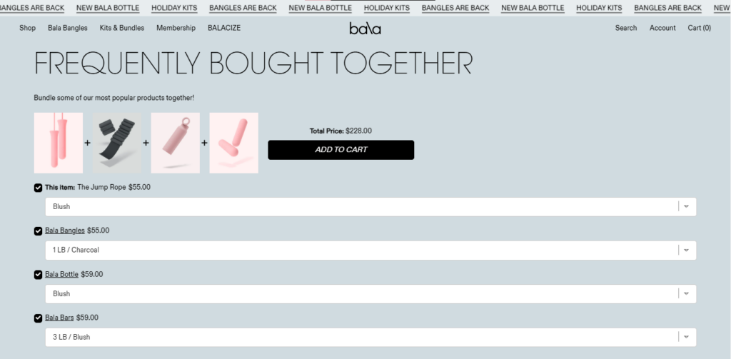
This layered approach amplifies AOV while feeling natural and helpful, guiding shoppers to explore products they might’ve missed.
Bala’s strategy proves that cross-selling isn’t just about increasing revenue but about enhancing the customer journey as well.
6. Employ urgency triggers that increase FOMO
Fear of missing out (FOMO) is a powerful motivator. By creating urgency on your product pages, you can encourage shoppers to act quickly instead of delaying their purchase.
Urgency works because it taps into the natural desire to avoid losing out on a deal or opportunity, which is especially effective in competitive ecommerce environments.
Here’s how to do it right:
- Use limited-time offers.
Display discounts or special promotions with clear deadlines to create a sense of immediacy. Countdown timers can add an extra layer of urgency.
- Highlight scarcity.
If stock is running low, let shoppers know. Messaging like “Only 3 left in stock!” can push buyers to act quickly.
- Be transparent.
Always make your urgency triggers truthful. Fake scarcity or misleading deadlines can harm trust and damage your brand’s reputation.
Chemical Guys, a brand selling car detailing supplies, demonstrates this perfectly on their leather care kit page.
On this product page, they offer a 35% discount, showing both the original price and the discounted price so shoppers can immediately see their savings. Below the purchasing call-to-action, they include an additional message: “Limited Time Kits Sale.”
This combination of visible savings and time-sensitive language creates a clear sense of urgency, encouraging visitors to buy before the deal disappears.

Chemical Guys’ approach demonstrates how urgency triggers, when used thoughtfully, can drive conversions without feeling overly aggressive. Make the deal feel both valuable and fleeting, and it will effectively turn hesitant visitors into motivated buyers.
Final thoughts
Each element we’ve covered today plays a crucial role in turning browsers into buyers, but remember: the magic happens when they all work together seamlessly.
Don’t try to implement everything at once. Start with the tactics that address your biggest conversion roadblocks, test them thoroughly, and build from there. Your customers will tell you what works; you just need to watch the data and listen.
So, pick one strategy and implement it this week. Sometimes, the smallest changes lead to the biggest wins.




![[SALE OFF] Discount 30% All Premium Extensions On Christmas And New Year 2025 christmas-and-new-year-2025](https://landofcoder.b-cdn.net/wp-content/uploads/2024/12/christmas-and-new-year-2025-1-218x150.png)

